Typography Meeting International Conference @ Portugal

Audience attending the 10ET at the Constantino Nery theatre, Matosinhos

This is just a short list to provide the links to all the previous editions of our conference. Organized with love by the community and the ATIPO:

First Edition, 2010 @ ESAD.CR, Caldas da Rainha
(no website)

Second Edition, 2011 @ UA, Aveiro:
entipografia.web.ua.pt

Third Edition, 2012 @ IPP, Porto:
esmae-ipp.pt/3et/

Fourth Edition , 2013@ IPCB, CAstaleo Branco/Idanha:
et.ipcb.pt

Fifth Edition, 2014 @ IPCA, Barcelos:
web.ipca.pt/5et/

Sixth Edition, 2015 @ UA, Aveiro:
6et.web.ua.pt

Seventh Edition, 2016 @ FAUTL, Lisboa:
7et.fa.ulisboa.pt

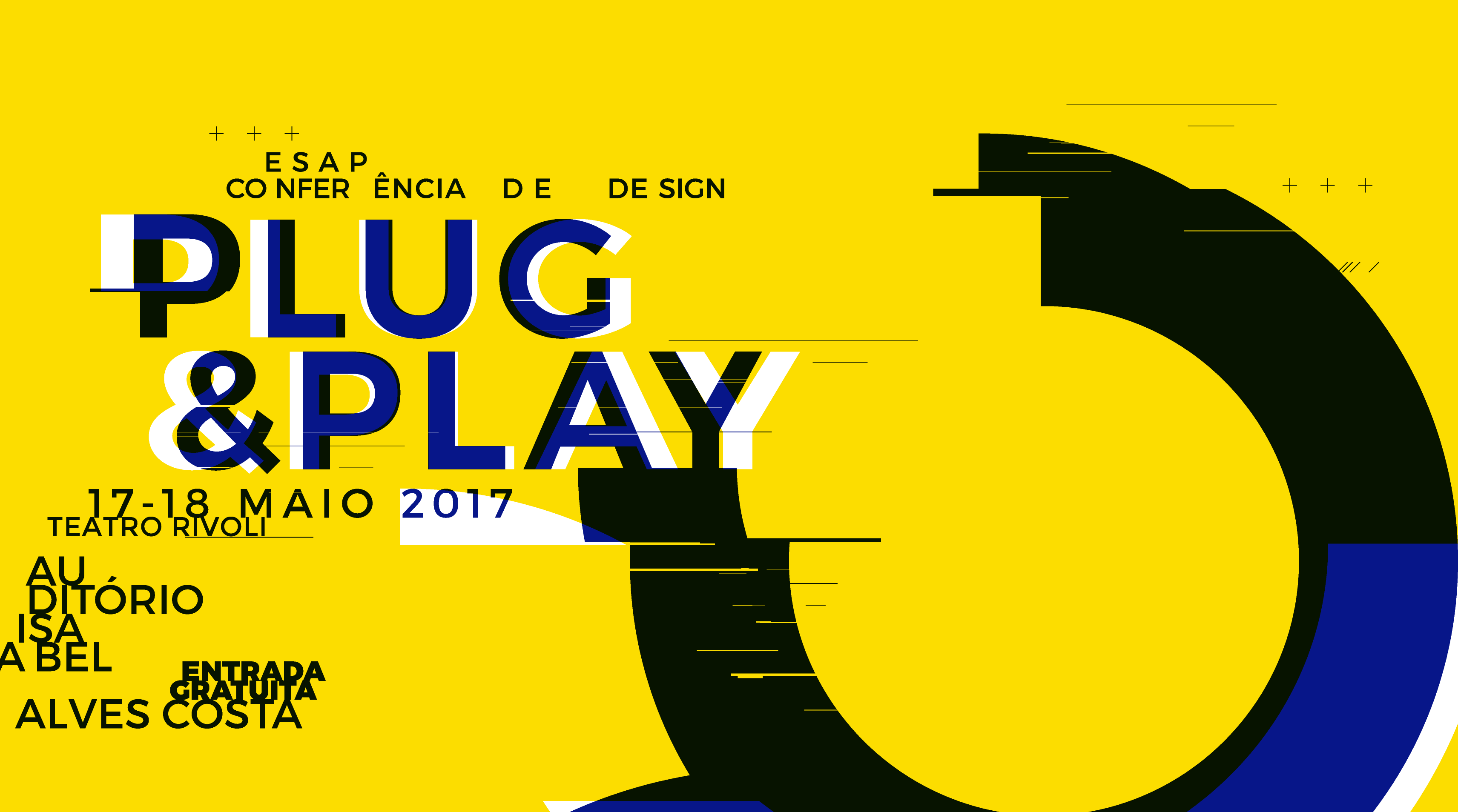
Eighth Edition, 2017 @ UALG, Faro:
et-8.ualg.pt

(Formally organized by the ATIPO association from here on)

Ninth Edition, 2018 @ IPT, Tomar:
http://9et.ipt.pt/

Tenth Edition, 2019 @ ESAD, Matosinhos:
https://10et.esad.pt/

(during the "hard" year of the Covid-19 pandemic there was no ET)

Eleventh Edition, 2021 @ ESAD.CR, Caldas da Rainha:
http://11et.ipleiria.pt/

Twelfth Edition, 2022 @ UBI, Covilhã
https://12et.ubi.pt/

Thirteenth Edition, 2023, @ Delli/UL, Lisboa
https://13et.ulusofona.pt/

Fourteenth Edition, 2024, @ UE, Évora
(T.B.A. soon!)

Enorme

DSType Enorme

Enorme. A personal take on modular typefaces

Tenho um carinho especial por esta fonte—um desenho modular que remete para as criações com o Fontstruct. Uma fonte geométrica, monoespaçada com uma ligeira mistura entre o grotesco e o construtivista ;)

Inspired by Russian Constructivism, Enorme is a bold, modular display typeface. At first glance it will look like a plain monospaced typeface, however that couldn’t be further from the truth. With over 3000 glyphs, all easily accessible through a simple set of opentype features, this typeface quickly reveals itself as more of a typographic playground.

https://www.dstype.com/fonts/enorme/about

Bürocratik new typeface

Bürocratik (Bruno Rodrigues) have designed a new branding typeface. Not much information about it yet, but it seems promissing ;)

NDiscover Bruta

Screenshot 2017-06-27 12.59.51.png

O Natanael Gama publicou recentemente a “Bruta”, uma grotesca não serifada, de inspiração baseada nos primeiros tipos grotescos do século XIX. Uma coleção enorme de variantes em peso e largura, conta com mais de 60 variantes.

Continue reading “NDiscover Bruta”

NDiscover Artigo Global & Artigo Pro

238439.png

A Joana Correia desenhou e publicou a Artigo Global e Artigo Pro no Myfonts na foundry NDiscover. Um tipo de letra serifado, humanista (com semelhanças ao Elzevir) da foundry que ela detém com o Natanael Gama — a NDiscover. É um tipo de letra clássico, mas muito atual, com inflexões pronunciadas e um contraste bem equilibrado.  A versão itálica tem uma forte  influência caligráfica, com traços que se assemelham ao lettering de pincel.

(está em promoção, com um desconto de 50%, até 23 de julho!)

Continue reading “NDiscover Artigo Global & Artigo Pro”

Underware & Martin Majoor at Plug&play17

00.png

Esta conferência já nos tem habituado a grandes nomes: Andreu Balius (2013?), Jean François Porchez (2015), Lucas de Groot (2016) entre muitos, muitos outros grandes designers, tipógrafos e artistas. Este ano, vão trazer-nos uma grande comitiva da Holanda: o estúdio coletivo Underware e o Martin “Scala” Majoor. É já na próxima semana a não perder!

17 e 18 de Maio de 2017, no Teatro Rivoli. A entrada é gratuita (mas os lugares esgotam rápido!)

Continue reading “Underware & Martin Majoor at Plug&play17”

DSType Fusta

O Pedro Leal apresenta, através da DSType, a Fusta. É um tipo de letra “inspirado nos tipos de madeira”, sem-serifa, para uso em display/ em títulos, de baixo contraste e elevado peso. Recheada de ornamentos, dingbats, carateres alternativos e ligaturas (discretionary) remete-nos para os desenhos de Ed Bengiat e a Ed Interlock da House.

Continue reading “DSType Fusta”